An average person generates 2.5 quintillion bytes of data every day, according to Social Media Today. A quintillion has 18 zeros in it. Massive numbers, right? Nowadays, almost everybody has a smartphone in their pockets, enabling the production of more and more data in the form of photos, videos, texts, and other geotracking data. Over the last few years, audio has also become part of the enormous amount of generated data because of the vast adoption of voice assistance devices, VoLTE (Voice over LTE) capabilities, and voice messaging capability becoming ubiquitous.
We see the same trend even in commercial scenarios where connected devices generate large amounts of data, including audio data, at an increasing rate. With the application of data science, this data could reveal previously unidentified insights and can also be used for the following tasks:
- Speech processing and recognition
- Audio fingerprinting
- Speech access control
- Conversational AI
- Audio classification
- Audio segmentation
- Audio similarity
- Music recommendation
- Audio tagging
- Audio source separation
These use cases are some of the more widely used ones in the industry. Audio data can also be used for many more tasks and be customized based on the requirements.
For any data science project, exploratory data analysis (EDA) is the first step after data acquisition. In an EDA, we try to understand data using sample exploration, basic statistics, and visualization.
The visualization part is comparatively easy for tabular and visual data. We can use a histogram, scatter plots, distribution plots, and other formats to plot images for visual and tabular data. On the other hand, visualization of audio data is not as natural to the human mind, and in this article, we discuss ways to visualize audio data. First things first, let us begin by understanding audio data better.
What is Sound/Audio?
Let us assume there is an air-filled balloon, and you puncture it with a pin. You hear the sound of the balloon bursting. What happened behind the scenes is this – when you punctured the balloon filled with high pressure air particles, the air particles rushed out and hit other nearby particles, and these particles hit other particles, causing a wave of air particles to bounce into one another. This created what is called a sound wave. Sound waves travel through a medium (usually air), and when they hit the eardrum, our mind interprets this as the sound of a balloon bursting.
To create sound, we need an object that can cause vibrations in its environment, pushing air particles and creating soundwaves, and a medium through which these waves can pass. In simple words, the sound is produced by the vibration of air particles due to pressure created by the object.
Visualizing Audio data
Now that we understand what audio is, visualization of audio data would make more sense. There are two tools to help us visualize audio, namely oscillogram and spectrogram.
Oscillogram and spectrogram are derived from the two fundamental components of sound, which are Amplitude and Frequency. Amplitude and frequency are vast subjects that cannot be covered here; however, if you wish to know more, you can refer to this beautifully written article on the components of sound.
For visualization, we use Python and Librosa. Librosa is a python package for audio data analysis. If librosa is not already installed, one can use the code below to install librosa:
Pip install librosa
Oscillogram
Audio is a time-series data, and it progresses with time. An oscillogram plots amplitude over time. Amplitude refers to the intensity of the sound in terms of how soft or loud it is.
Here we load and decompose an audio file and then plot the data using the librosa display function.
# load an audio file and decompose into n-dimensional array
Audio_data, sampling_rate = librosa.load(librosa.ex(‘brahms’), duration=3)
# plotting an audio time series data
fig, ax = plt.subplots(nrows=1, sharex=True, sharey=True, figsize=(18,7))
librosa.display.waveplot(y, sr=sr, ax=ax)
ax.set(title=’Oscillograph’)
ax.label_outer()
The above code returns the visualization below.
Spectrogram
A spectrogram is a visual representation of sound where we plot the intensity of frequency over time. Frequency refers to the number of sound waves per unit time. At any point in time, a sound is a combination of multiple frequencies such as 10 Hz, 50 Hz, 300 Hz, or others, and the intensity is different at each frequency. A spectrogram represents intensity variation in frequencies over a period.
For spectrogram, we compute discrete Fourier transform of loaded audio data first and then convert the amplitude spectrogram values into DB scaled spectrogram values.
Let’s see a spectrogram with a code and a graph. We will plot spectrogram at linear and log scales.
# loading audio file
audio_data, sampling_rate = librosa.load(librosa.ex(‘brahms’), duration=10)
fig, ax = plt.subplots(nrows=2, ncols=1, sharex=True, figsize=(15,10))
# ploting for linear scale
# fourier transformation and amplitude to DB coversion
db_data = librosa.amplitude_to_db(np.abs(librosa.stft(audio_data)), ref=np.max)
librosa.display.specshow(db_data, y_axis=’linear’, x_axis=’time’,sr=sr, ax=ax[0])
ax[0].set(title=’Linear-frequency power spectrogram’)
ax[0].label_outer()
# ploting for log scale
# fourier transformation and amplitude to DB coversion for log scale
hop_length = 1024
db_log_data = librosa.amplitude_to_db(np.abs(librosa.stft(audio_data, hop_length=hop_length)), ref=np.max)
librosa.display.specshow(db_log_data, y_axis=’log’, sr=sr, hop_length=hop_length, x_axis=’time’, ax=ax[1])
ax[1].set(title=’Log-frequency power spectrogram’)
ax[1].label_outer()
fig.colorbar(img, ax=ax, format=”%+2.f dB”)
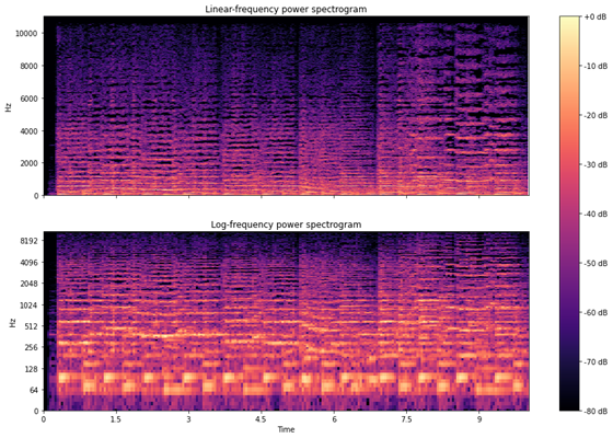
Here, yellow represents very low intensity, and dark blue represents very high intensity. We can also see that some frequency spectrums have near zero intensity, and some have high intensity.
These are two ways of ingesting audio data with our eyes instead of just our ears. In the following article of this series, we go through feature extraction from audio data.
Be it audio data or image, text, tabular data, for a data science project to be successful, an organization requires expertise throughout the machine learning lifecycle, from data collection to deployment. eInfochips can help you with each stage of the machine learning life cycle.
At eInfochips we have worked on many projects using Audio data such as speech based access control, voice assisted QA, the voice assistant for smart appliances, and more. We are a technology and engineering partner for many fortune 500 companies. We help clients with business modernization and digitalization with our deeply rooted artificial intelligence capability on edge and cloud both. We have machine learning capabilities not only in audio data but also in visual, images, tabular, and time-series data. For more information on Audio Data Visualization, please free to contact our experts today.


